More Oil Pastels
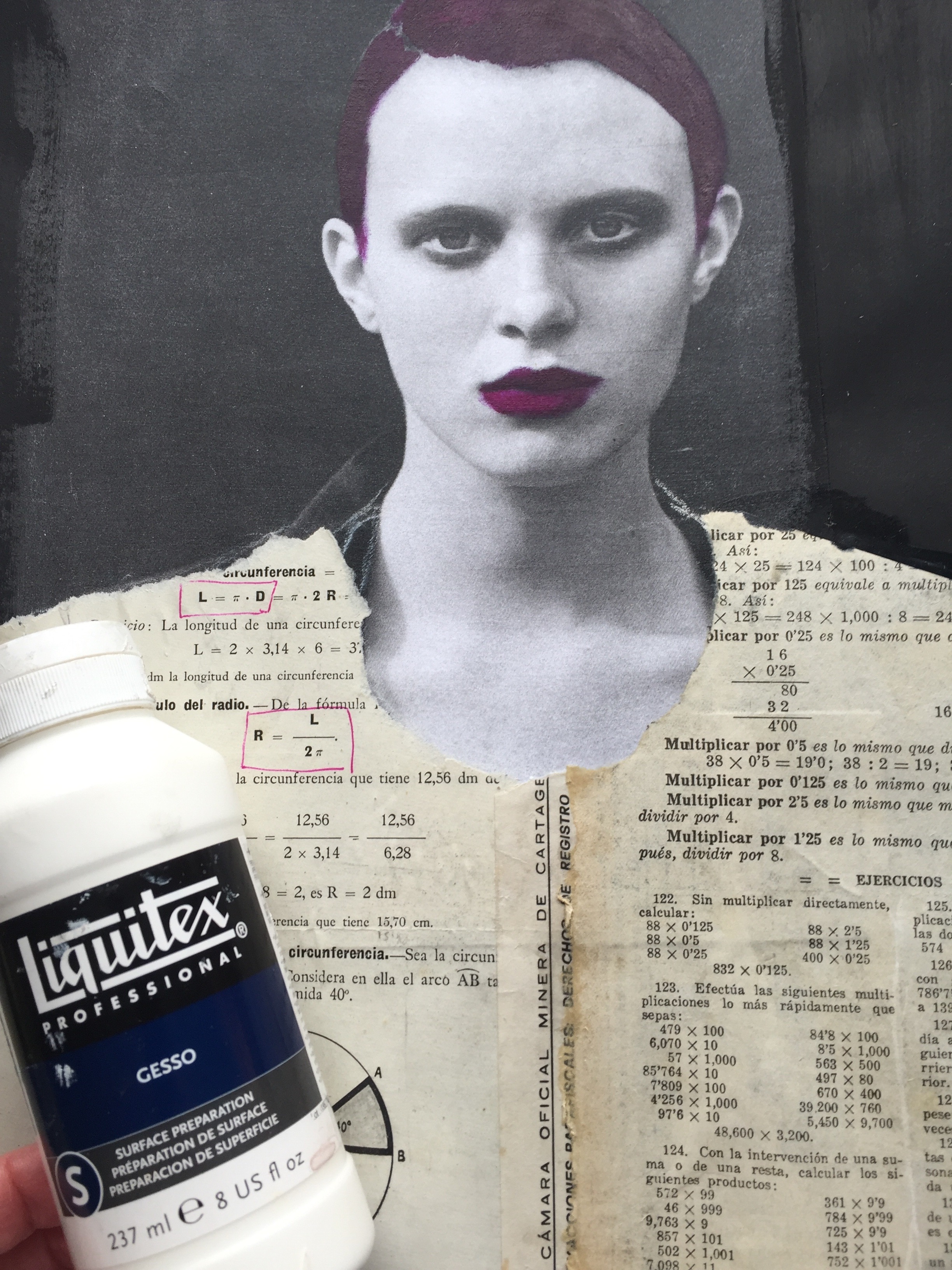
Magazine pages are pretty amazing to work with. Not only because there are no rules and therefore fun to do but also because I learn so much about the art of drawing and painting each time I do one. Below you see the before and the after of a recent makeover. I photocopied and enlarged the image 160% then used matte medium to glue her into my large sketchbook. She was already a B&W image from W Magazine Then I used clear gesso over the entire thing, adding black gesso to all the intimidating white that remained.

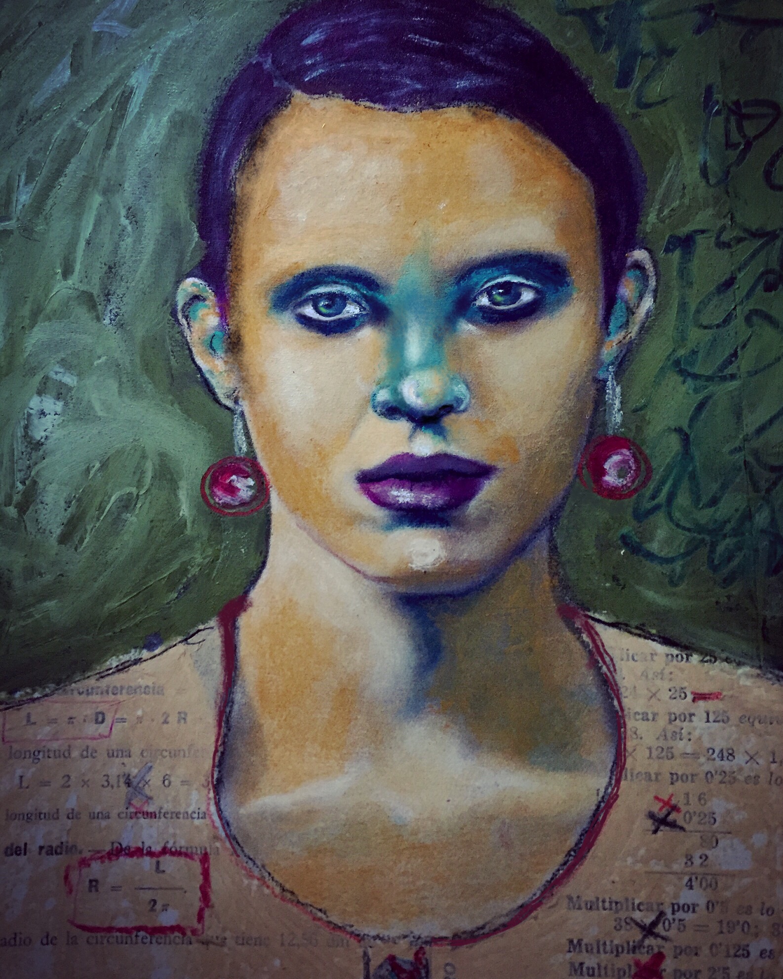
I had already made up my mind I wanted to add collage since all she was wearing was a suit coat that did nothing for me in terms of imagining a clothing makeover using that. I didn't overthink it. I pulled out the first thing from a pile of collage material and ended up with an Italian math workbook. So she became a mathematician in my mind. And Italian. And cool. My color choices were based on the magazine image below done by my initial inspiration artist Guim Tio'. This complimentary yellow purple isn't generally appealing to me but I really liked his result so I quickly decided to just go with it. So now I have violet hair and violet lips. Really? That meant I was willing to use yellow ochre for her skin. I was not too sure about this but I did it anyway. I am keeping the idea of experimentation in the forefront of my mind. I told myself it didn't matter

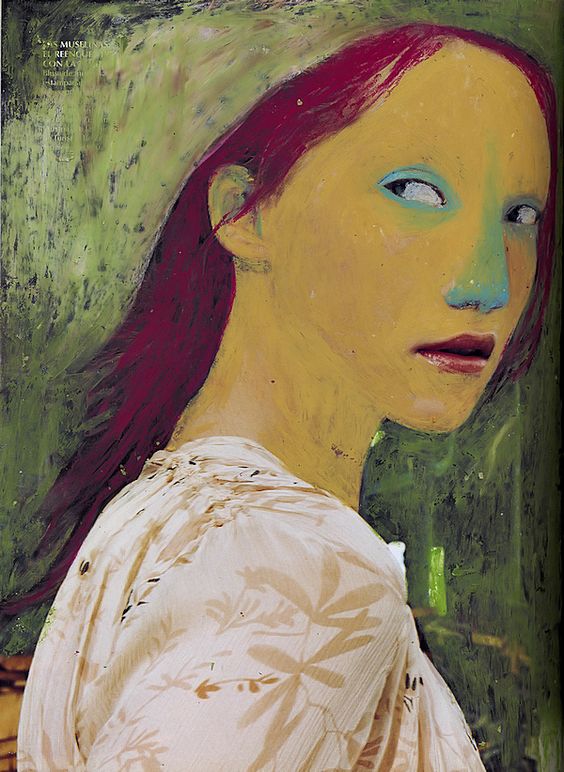
So I used the matte medium to change her clothing and put a coat of clear gesso over that. I used acrylic paint for her hair because no way dod I have that color in the oil pastels. So once that commitment was made I moved on without stressing too much. Upon further reflection after the fact I think what I especially had liked about what he had done was the solid abstracted shape of her face and nose. And i think I wasn't able to let myself go that far. Next time....
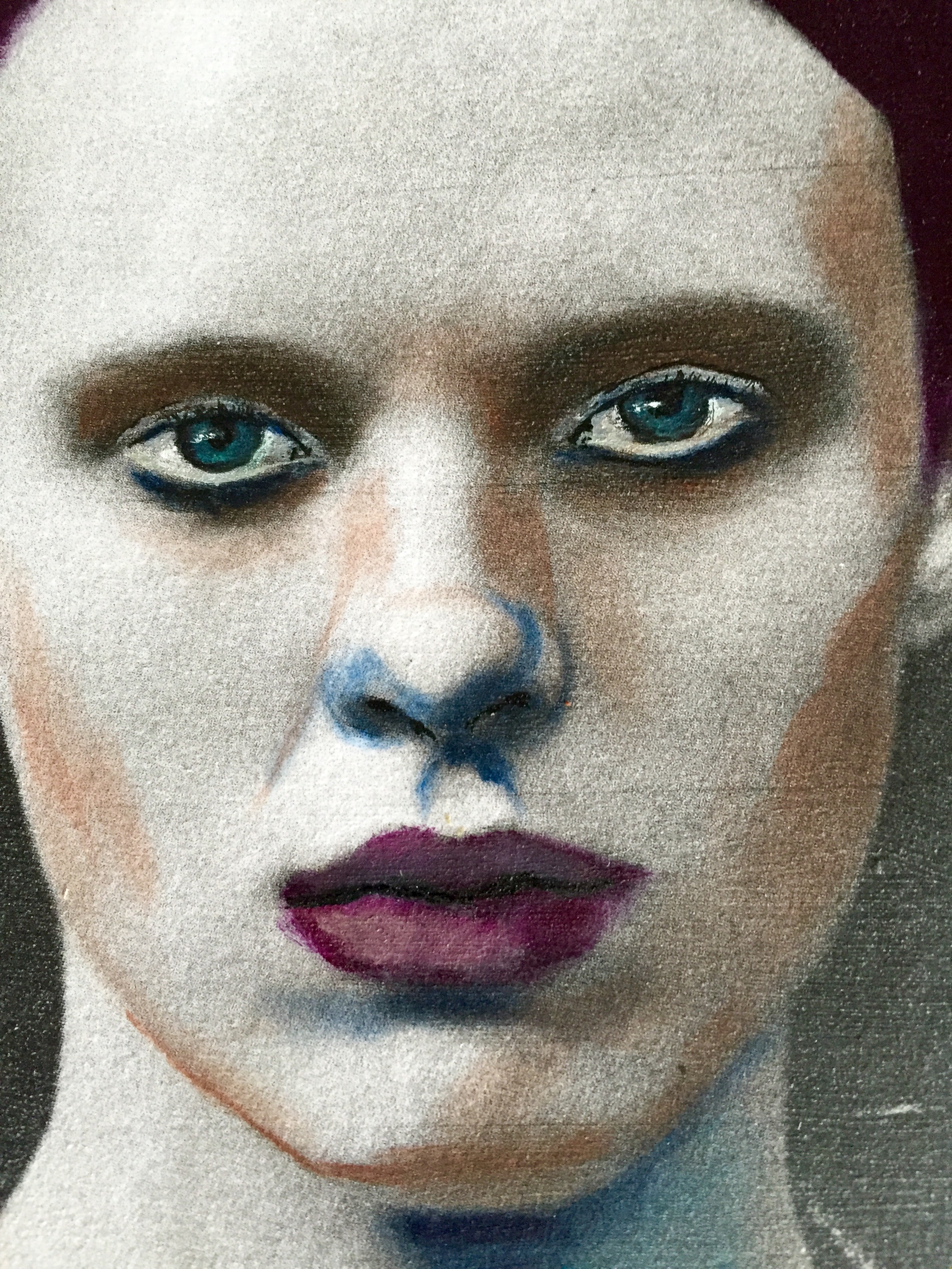

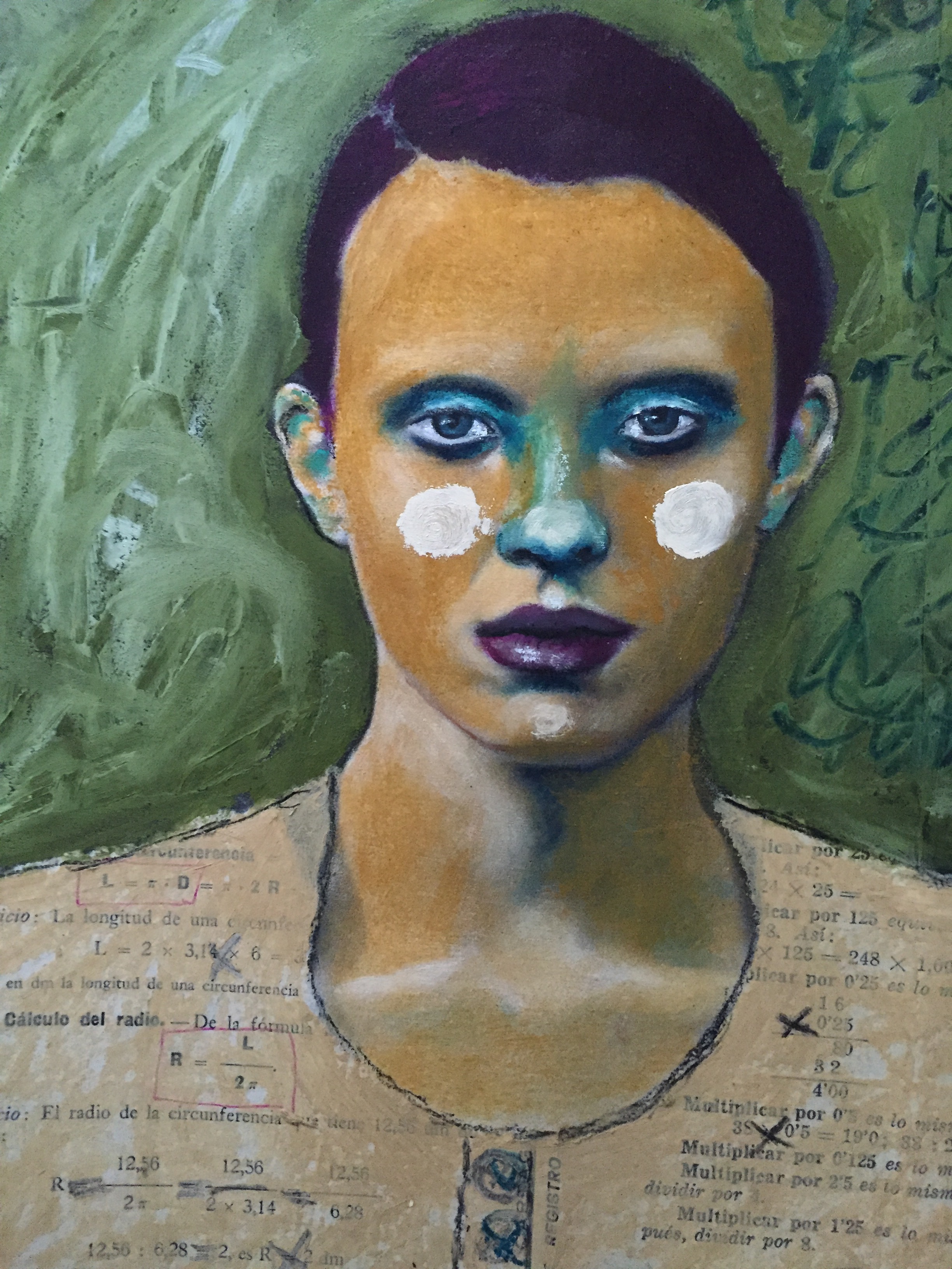
I took the opportunity to really focus on the lights and darks as shapes and added umber and dark blue to the areas I could map on her face. The is a fairly high contrast image since it was editorial high fashion image not a makeup ad. I added all of the colors with a very light handed touch wanting to work in layers and build up a variation of tones. So all of her face is yellow ochre in the middle photo above, just applied in varying layers. I also chose to focus on her eyes since in my mind that was the focal point of the image. The intensity of her look. So her eyes are a combination of oil pastel and charcoal. I thinned the oils pastel and used a fine brush more or less like traditional oil paint. The background is super thick with three shades of green applied in patches then smooshed around, (not too much) with my fingers. Most of the painting was done with straight pastel, no thinner and with my fingers as the blender.
I think the red earrings and red marks in her shirt are key elements to bringing some life and energy to the painting. Otherwise she seemed very subdued and even serious in spite of her having a green nose. Her name is Liliana.

And here she is in her final complimentary color glory! Another lesson learned is that it's just not my palette.
Love, Robin
**If you are interested in learning more about using oil pastels and magazine pages go to my class page and read more!